Anthropologie catalogue
18th November 2011
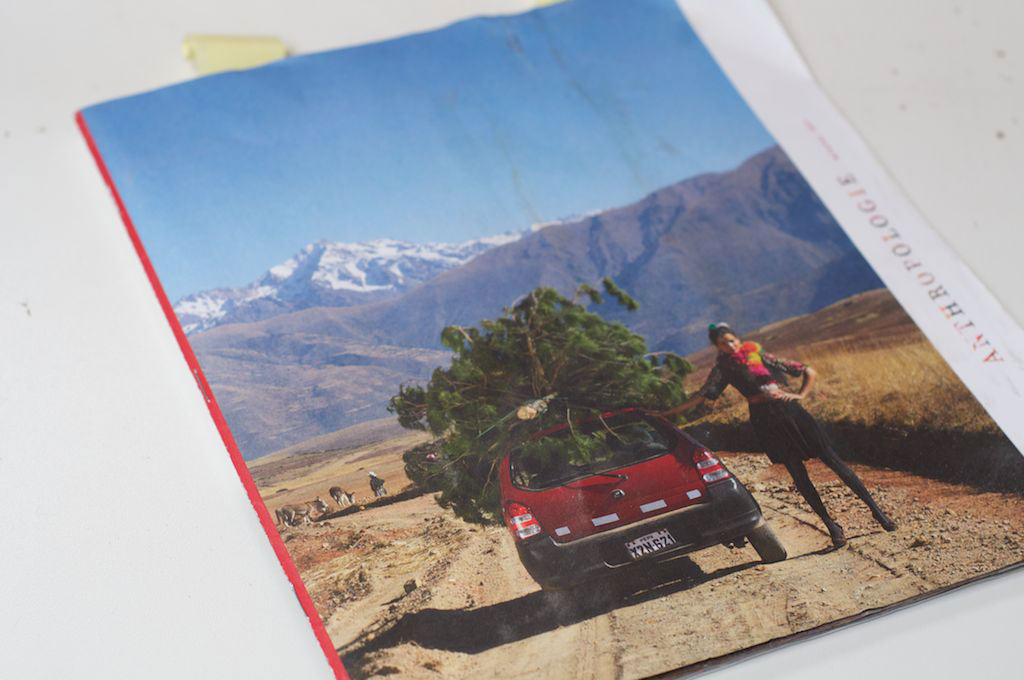
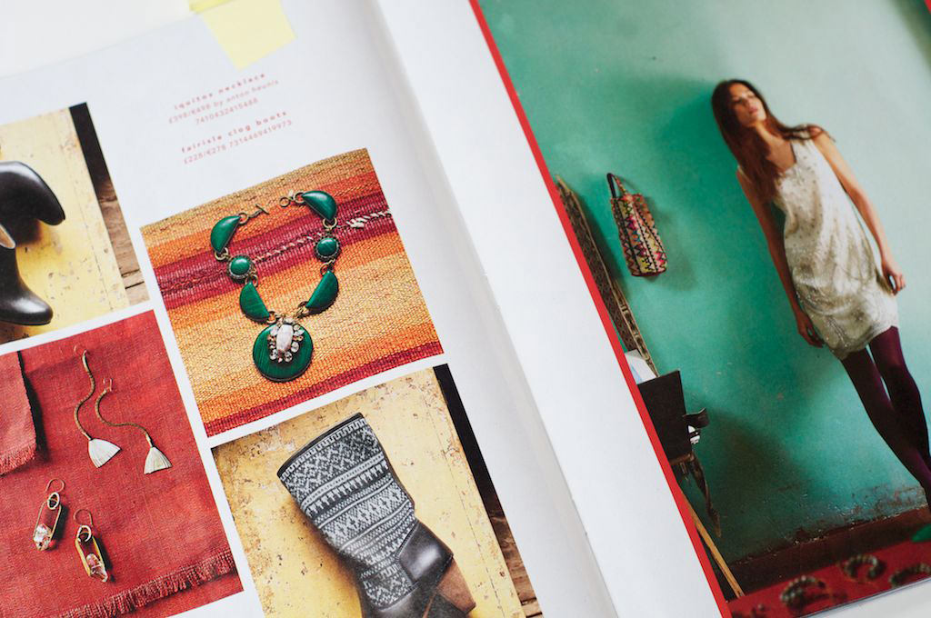
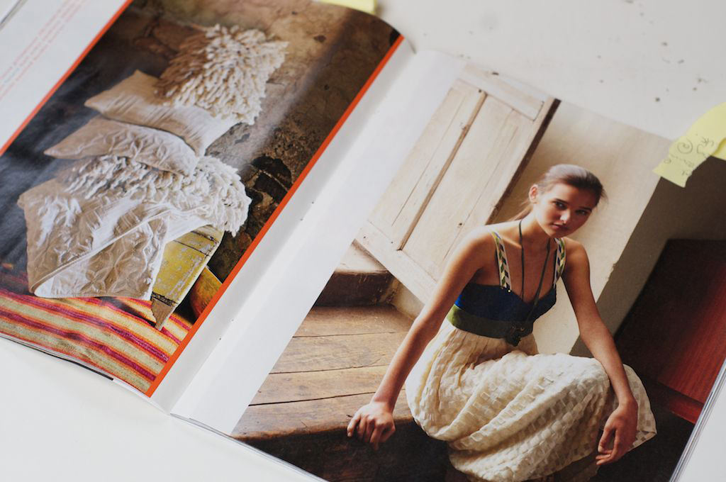
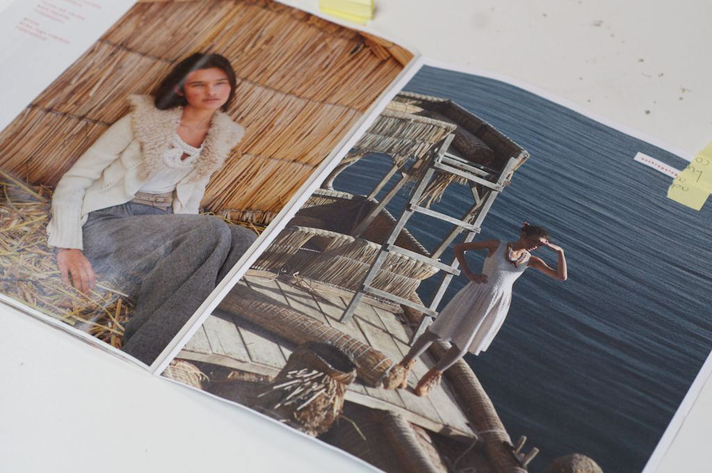
I love this catalogue. It’s the first really cool catalogue I’ve seen for some time that doesn’t use matt card throughout. it has a newspaper supplement feel to it, with thin rippling satin sheen internal pages with a lightweight matt cover and cheap and cheerful staples. What makes it work is the proportions (nearly square) and the colours (a Moroccan feel) and atmosphere (soft dramatic lighting and natural materials).
I really hope to get some of that feel into our new accessories photo shoots. To that end, Robin roughly plastered a brick wall on our mezzanine yesterday, which we are going to paint, wallpaper, strip, repaint until we can create a backdrop to some of our products that has the texture and vibrancy that makes the Anthropology catalogue so memorable. Zingy faded turquoises and terracotta textiles is a great combination.